Background
About the IGS
The International GNSS Service (IGS) has ensured open access, high-quality GNSS data products since 1994. These products enable access to the definitive global reference frame for scientific, educational, and commercial applications – a tremendous benefit to the public, and key support element for scientific advancements.
Why redesign?
The Central Bureau design team received a lot of site feedback from you, the IGS user community, in regards to the igs.org website. After carefully reviewing your feedback, the team decided it was time to redesign the site and address community pain points:
- For Early Careers and Students, difficulty to learn more organically/intuitively with the immense amount of site content and data to look through.
- For Geodetic Scientists, unable to discover needed data/information due to poor navigation and information being outdated.
- For Decision Makers, unable to find out how their contributions are leveraged to both their organization as well as general public benefit
By resolving these pain points in the redesign, we hope to improve the community’s overall user experience (UX) on the site and the site’s user interface (UI).
Redesign Process Overview
The Central Bureau design team began evaluating feedback and cataloged it into three categories: navigation, site design, and content. To better understand the IGS user community, we developed three personas representing our key audiences: Early Careers/Students, Geodetic Scientists, and Decision Makers, detailing their tasks, goals, and pain points. Once pain points were established, the team configured the sitemap to resolve not only the issue of navigation, but to help see what content is missing. Lastly, the team started developing the site using a more streamlined system and features that would greatly improve the site’s overall design.
Evaluation
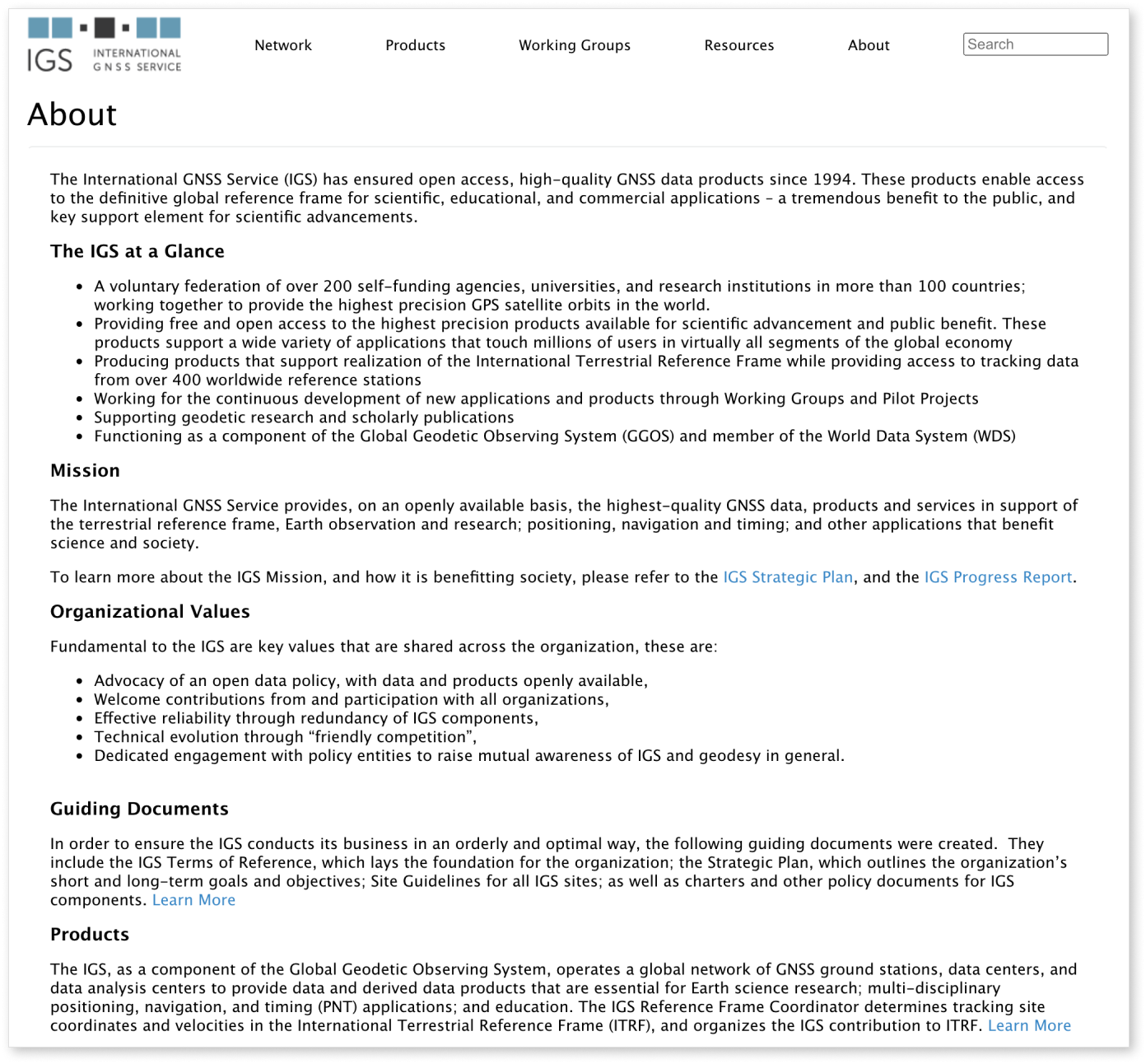
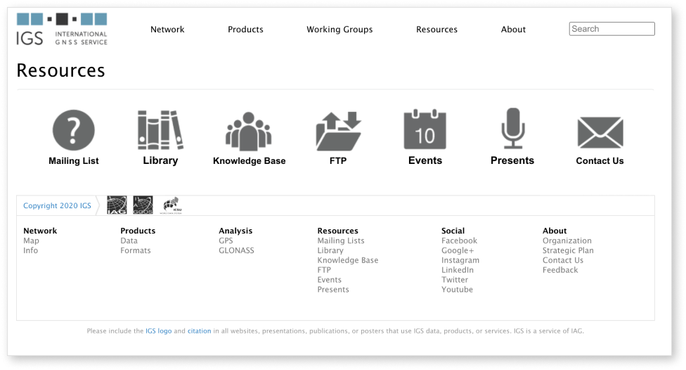
The Central Bureau design team began evaluating community feedback on the website and have categorized them into three key issues: navigation, design, and content. These three categories served as the stepping stone toward improvement. The following screenshots below are taken from the old igs.org website.
Navigation
The old igs.org navigation menu had only had 5 top-level links with no dropdown menu. With the vast amount of information the IGS has, this made it difficult to navigate through the site without having to dig deeper. The old footer contained additional links, but a large amount of links were only within the content of internal pages. Furthermore, users were relying on the search function in order to find items. By analyzing analytics data, the Central Bureau design team found that the top traffic channel was “Organic Search.”


Site design
The old igs.org website was built many years ago and was not updated to keep up with the latest website design trends. Site design issues included:
- Minimal visuals and graphics
- Inconsistent layout
- Extremely text-heavy, making it hard to stay engaged
- Poor accessibility- no alt text, an inconsistent hierarchy, nor features to help improve accessibility
These issues made it hard for users to have a good user experience.
Content
One of the fundamental values of the IGS is to “Welcome contributions from and participation with all organizations,” however these contributing organizations and external relations were not prominently featured anywhere on the old site. It was also difficult to find out how to or why users should contribute to and participate in the IGS. It is important to have these items as a page on the website to fulfill our values and bring recognition to those who help support the IGS.
Personas
The Central Bureau design team sought to understand the diverse perspectives of the IGS user community. Subsequent community feedback is represented in three fictional “personas” to describe the goals of individuals visiting the IGS.org website, as well as identifying possible pain points that would prevent a visitor from successfully interacting with the website and its resources.

Early Career/Student
As someone new to the Geodesy world, students need a better way to easily learn about the IGS and Geodesy because they may get overwhelmed by the massive amount of information.
Learning about Reference Frames
Using Multi-GNSS data in research
Goal is to learn more about the International GNSS Service and geodesy
Needs geodesy data for early career research
Difficult to try and explore what information is available in site due to poor navigation
Difficult to learn more organically/intuitively with the immense amount of site content and data to look through
Geodetic Scientist
As an engineer in the Geodetic community, geodetic scientists need an easier way to find important data because they need the data for research on GNSS systems.
Promote the use of new navigation signals and constellations within the IGS
Develop data products for Galileo, QZSS, BeiDou and other emerging navigation systems
Goal is to develop and implement new standards for Multi-GNSS-related work within the IGS
Needs to interact closely with other IGS entities
Unable to discover needed data/information due to poor navigation
Inadequate acknowledgment of contributions by working groups
Outdated information
Information stored in different places, in an inconsistent and non-intuitive manner


Decision Maker/Contributor
As the decision maker, contributors need a way to learn about how the IGS benefits the general public in order to fund and support IGS research.
Exploring research within different organizations
Budgeting funds in support of other organizations
Goal is to support and fund research they believe in
Needs the importance/value of contribution and recognition
Difficult to find how the IGS benefits the general public within the sitte
Cannot see that decision maker’s organization is appropriately acknowledged
Cannot find out how their contributions are leveraged to both their organization as well as general public benefit
Sitemapping
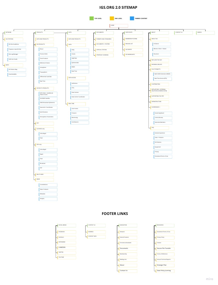
To rethink the igs.org navigation, the Central Bureau design team took a step back and created different sitemap iterations of the website. After brainstorming different versions, the team finalized a clear navigation system that includes key content missing from the original site and creates an easier user flow for new and active users.
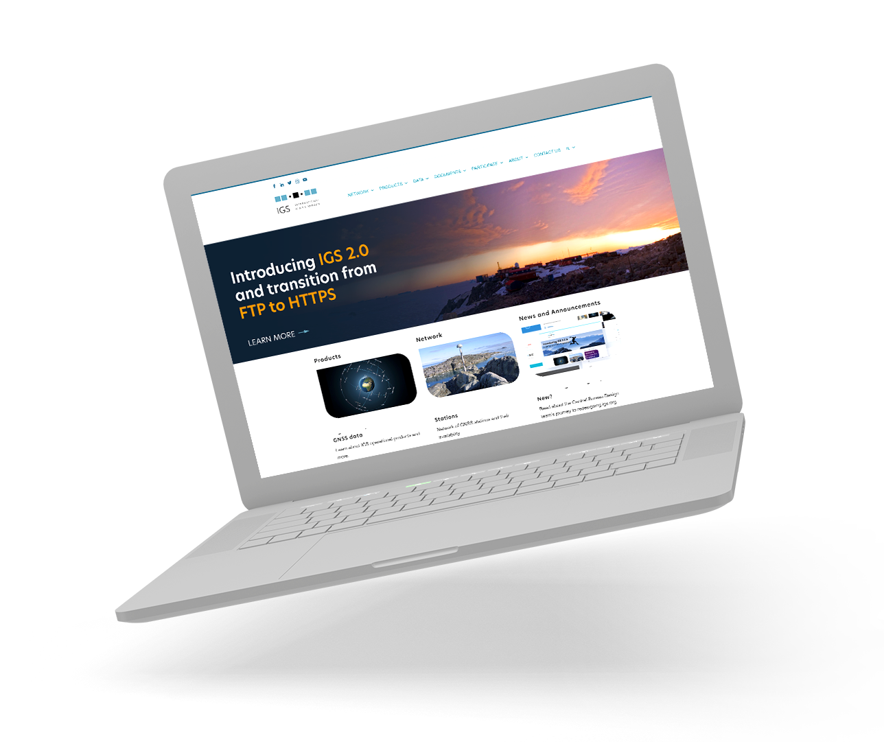
Introducing IGS.org 2.0
Enhanced Home Page
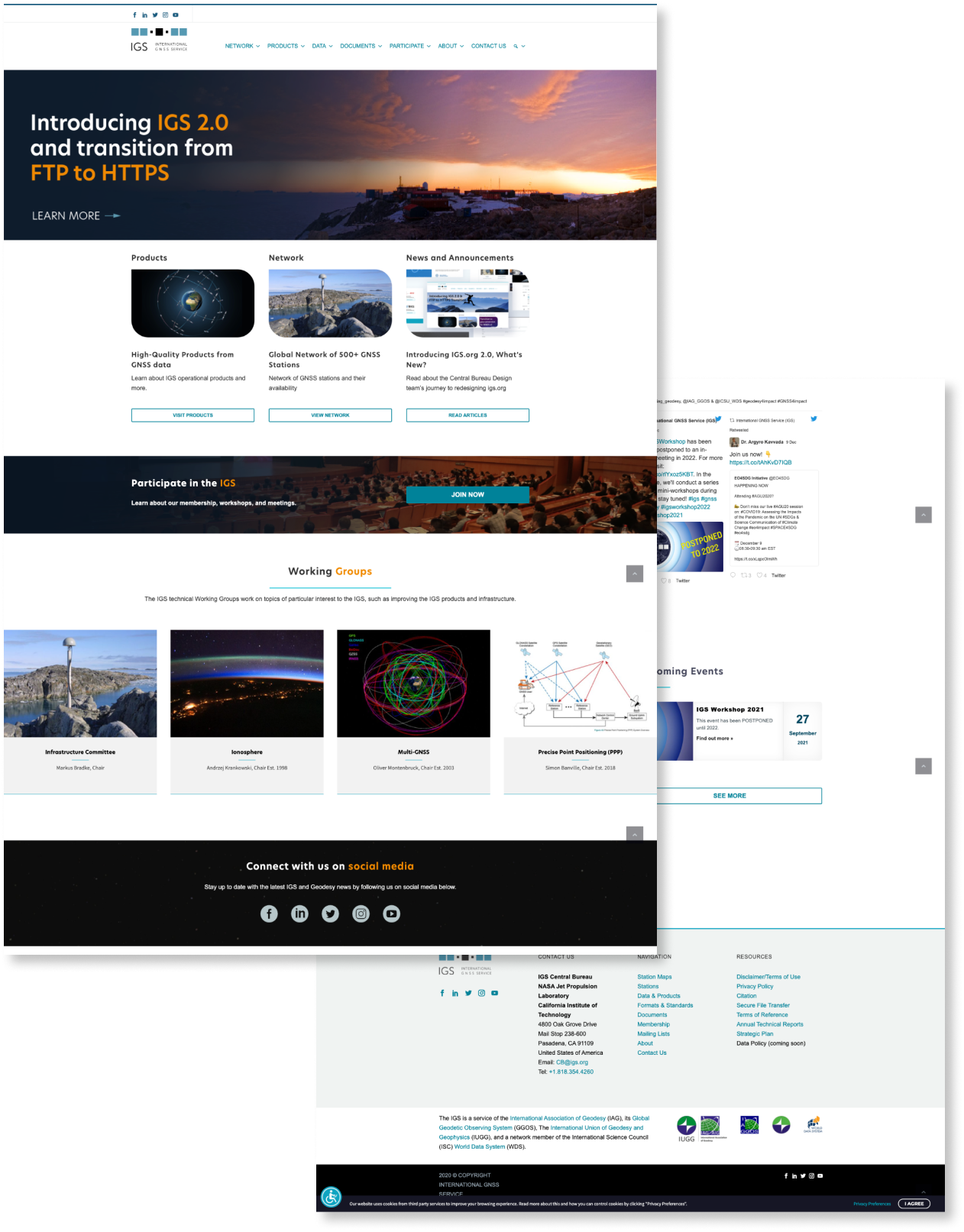
The new igs.org home page has been enhanced for diverse community engagement, with an eye-catching banner for the latest news and announcements, a slider highlighting IGS working groups, and a twitter feed to encourage users to follow us on social media to stay up to date.
Mega Menu
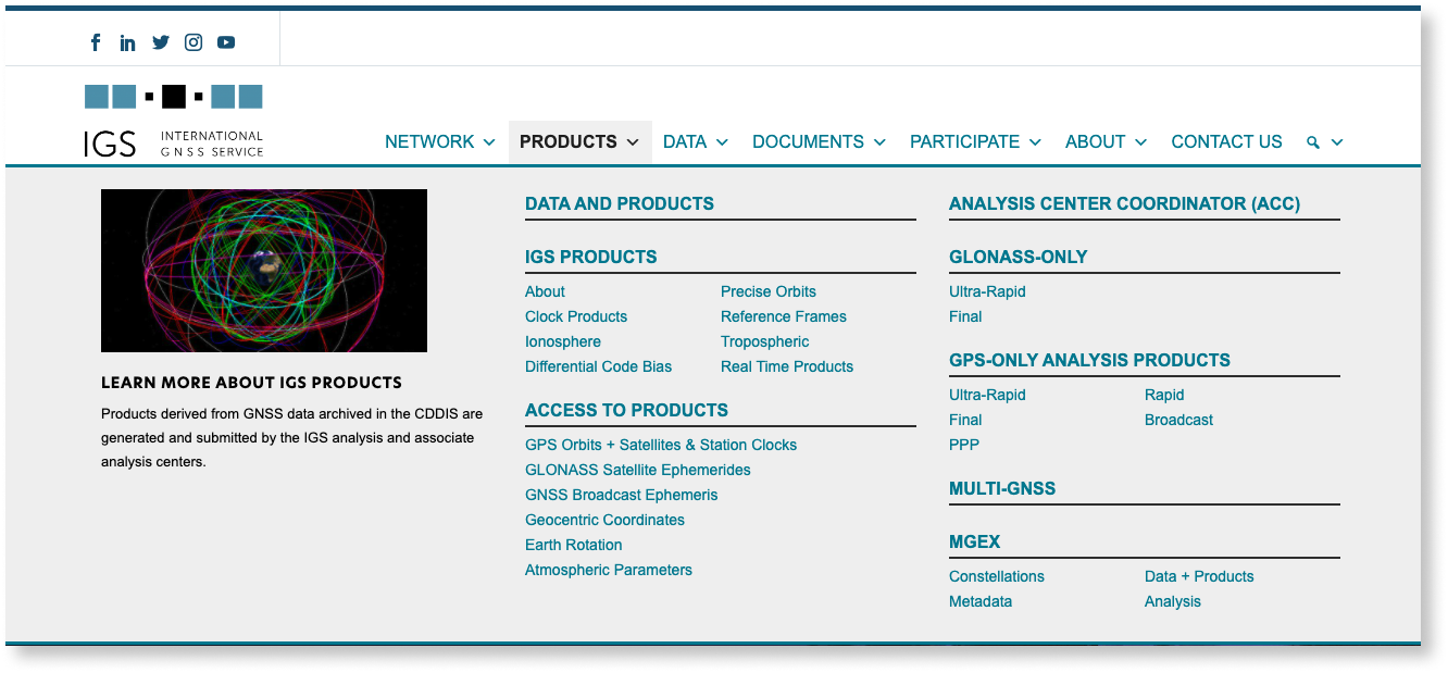
A Mega Menu navigation, compared to traditional dropdown navigation, better supports the new and improved sitemap by ensuring all links are clearly shown and easily accessible to users.
Working Groups + Pilot Projects
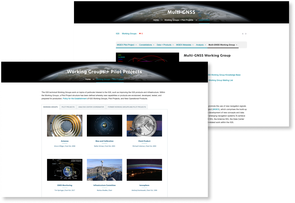
IGS Working Groups and Pilot Projects are an important part of the IGS community. In this new website, IGS Working Groups and Pilot Projects are heavily featured, appearing on both the home page and it’s own dedicated page. Now users can find all the information about a particular working group or pilot project in one place. Additionally, working group chairs now have the ability to securely manage their respective pages to keep them up to date with the latest information.
Contributing Organizations
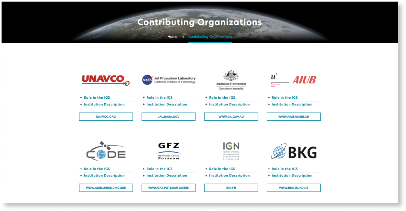
Another important part of the IGS community are its contributing organizations. There is now a dedicated page that features contributing organizations where users can learn more about their role in the IGS as well as about that institution. To add your organization, please fill out this form: Add Your Organization.
Events + News
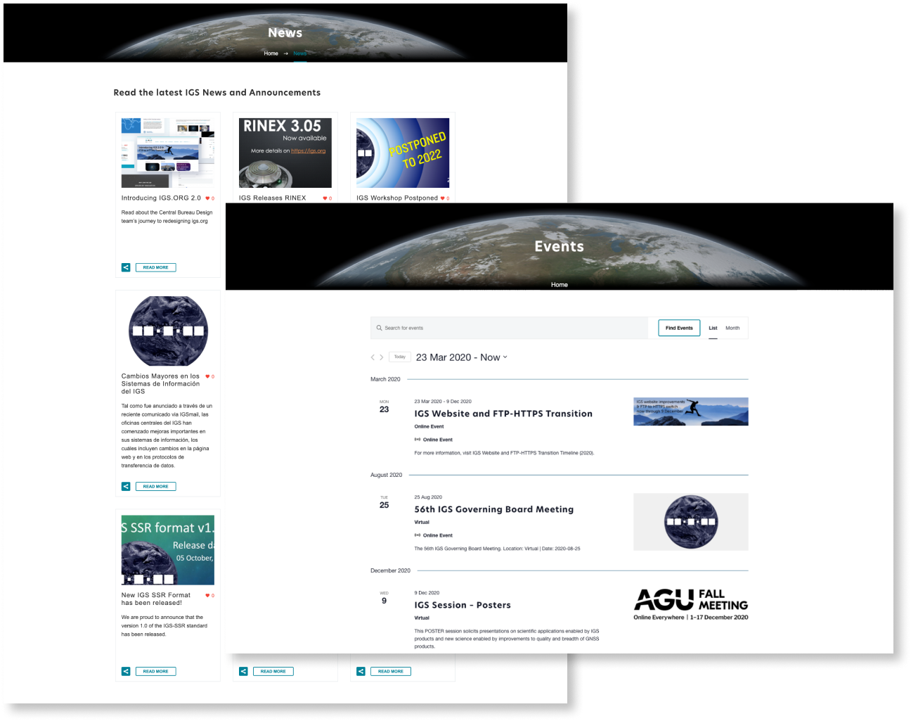
Viewing IGS Events has been enhanced with easy viewing and navigation, including the ability to search, change view from list to month, and export events onto your Google or iCal calendars. To keep our users up to date with the latest news and announcements, the team also updated the news page design with a grid display of all news articles and added visuals.
Improved Accessibility
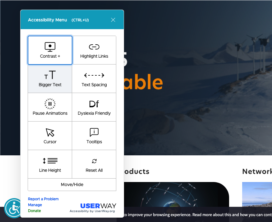
The Central Bureau Design team improved on site accessibility by carefully examining the site to make sure images contain alt text and that there were little to no contrast issues. For extra aid to users with disabilities, the team utilized the “World’s Leading Automated Website Accessibility Solution,” Userway Accessibility Widget. Search for the blue person in wheelchair icon on the bottom left of the screen to test out the widget’s accessibility features. The team is actively working on making the site more accessible for all users.
Last Updated on 1 Nov 2022 00:44 UTC


